It’s Monday, so that means images. But this Monday also means a site update so minor, you probably won’t notice (at least I hope you don’t). Since I don’t have the time or energy to become an html master (or even a novice), I use a WordPress theme so aPlateOfGrapes.com doesn’t look like the site was designed by… well, me. I have a few minor quibbles with the theme, so I just use the editor to make it look all purdy (well, to me anyway). Unfortunately, every time there is an update to the theme (few times a year), it overwrites all the adjustments I’ve made in html. One piece in particular, the header, always seems to cause me fits so I wrote myself a little note to remind myself what to do when this happens and, once I finished, I thought it was worth sharing:
How to remove space at top of website
- Curse loudly because this is effing annoying. Do you really need the site to look just so? No one notices and you’ll save yourself 15-20 minutes of frustration.
- Inspect elements to be removed
- Open editor
- Go to header.php
- Save header.php copy into .txt file because, if you don’t, shit will break horribly
- Delete shit until it looks right
- If you need to add space add as many <br/> line breaks as necessary. For example:
<br/>
<br/>
<br/>
<br/>
- Think twice about updating site in the future.
OK, on to the images…
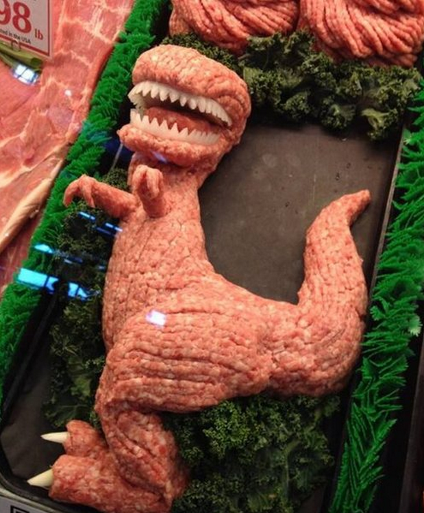
You’ll recall a while back the Cookie Monster I spotted in an area butcher shop. Well, looks like another meat department has upped the ante:

I think it’s worth noting that this could also be a skinned baby theropod (thank you Dinosaur Train).
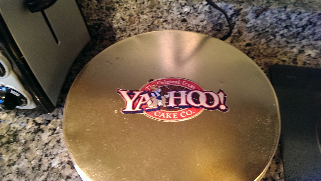
Next, is something I’ve seen many times at my in-law’s camp. I think you’ll find this cake logo oddly familiar:

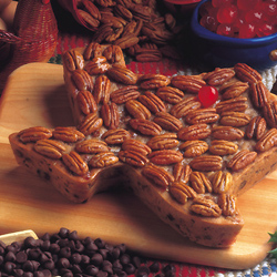
This thing looks old, so I’m sure they predate the other Yahoo!. (Not sure if I needed to put the period after the exclamation since it’s part of their logo, but I don’t have my Chicago Manual of Style handy). Turns out The Original Texas Cake Co. still exists and they make all many of cakes. Including one that looks like Texas.
